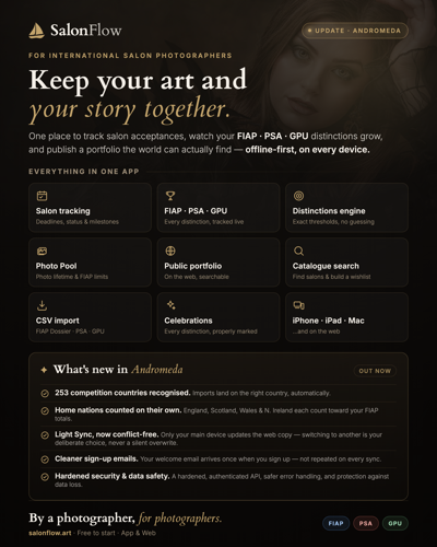
From a photographer, for photographers.
SalonFlow is the only app of its kind. It keeps a photographer's entire portfolio, every accepted image and every award in one place, and tracks their progress toward FIAP, PSA and GPU distinctions exactly according to each association's official rules.
Replace spreadsheets, paperwork and guesswork with one calm overview. The photographer should worry about their craft, SalonFlow takes care of the numbers, deadlines and rules on their behalf.
Precision
Every calculation matches the official FIAP, PSA and GPU rules. No shortcuts that could mislead a photographer.
Calm
No stress, no red, no exclamation marks where something is simply information. Limits are communicated neutrally and factually.
Craft
Built by one photographer for photographers, with a curated, hand-made approach. Not a mass-produced utility.
A knowledgeable but human friend in the exhibition hallway. It speaks the photographer's language, never the language of a spreadsheet.
A sailboat on course for the title.
The mark is a stylized sailboat: two sails separated by a thin negative-space line, above a wave-shaped hull. It refers both to sailing toward a goal, that is, progress toward a distinction, and to the classic elegance of a photography exhibition, a "salon". The SalonFlow logotype is always set as one word, in a single cut of the typeface, using only two colors.

Left: the version for dark backgrounds (gold sailboat, ivory "Salon", gold "Flow"). Right: the version for light backgrounds (black/umber sailboat and "Salon", gold "Flow"). No other combination is used.
Mark on the left, logotype and tagline stacked in the right-hand column — for compact horizontal placement (document header, email signature, wide banners) where there isn't enough height for the vertical primary lockup. Colors follow the same rule as the primary lockup. The logotype is a precise vector reconstruction of the wordmark (see the Vector Anatomy section), not a live-set font.
The growing product family (SalonFlow, SalonFlow Light, SalonFlow Search) has its own lockups. The mark and the SalonFlow logotype stay unchanged; a subordinate word (Light or Search) is added below them, set live in Inter Light 300, all caps, wide tracking, in Warm Taupe #8A7D6E, the caption color of this palette. The word is always smaller and lighter than the logotype, never gold and never bold, so it reads as “a variant of SalonFlow”, not a standalone name. Each sub-brand has a vertical and a horizontal lockup, for dark and light backgrounds, in SVG and PNG (solid and transparent), under assets/02-znak-a-logotyp/sub-znacky/.




The minimum clear space around the mark equals the width of the main, rear sail (X), roughly half the mark's overall width (the exact value is in the Vector Anatomy section). No text, artwork or edge of the layout may enter this zone, whether on a poster, in a web header, or in the App Store.
mark alone, digital
mark alone, print
full lockup with name
Below this threshold the mast line and the gap between the sails start to visually merge. Use the sailboat alone, without the name, for a favicon or an avatar.
The geometry of the mark, down to the last point.
The logo isn't just the sails. It's the mark and the "SalonFlow" logotype, in a precise ratio to each other, and both are broken down separately here. The mark's vector master (SVG) follows the true contour with straight segments at 99.0% area overlap (IoU) against the master raster of 1024 × 1024 px, with no smoothing that could pull the shape away from the source. The ratios below describe this vector's geometry directly and are the binding reference for print, engraving, vinyl cutting, and any large format.
| Element | Ratio |
|---|---|
| Overall mark proportion (w : h) | 595 : 698 px ≈ 1 : 1.17 |
| ASails : hull (height) | 548 : 145 px ≈ 3.8 : 1 |
| CHull width vs. sail width | hull 100% · sails 91% |
| DWidth of the sail block | 544 px (91.4% of total) |
| Width of the main, rear sail (unit X) | 295 px (≈ 49.6% of overall width) |
| EOffset between the sail peaks | main sail +7.3% h. higher, +4.4% w. to the right |
| BMast gap (cross-section at foot) | ≈ 8.6% of overall width |
| Position of the mast gap | 30–39% of width from the left |
| Waterline (sails → hull) | hairline, < 1% of height |
The hull is exactly as wide as the whole mark. Its stern, the right-hand point, juts out beyond the edge of the sails, which is why the mark visually "sails" to the right. The bow, the left end of the hull, is softly rounded, while the stern tapers into a sharper point.
| Element | Ratio |
|---|---|
| FMark height : wordmark height | 581 : 51 px ≈ 11.4 : 1 |
| GMark → wordmark gap : wordmark height | 60 : 51 px ≈ 1.2 : 1 |
| HWordmark width vs. mark width | wordmark 65% of mark width |
| Vertical breakdown of the full lockup | mark 84% · gap 9% · wordmark 7% |
| Horizontal centering | mark and wordmark share one axis (< 1% offset) |
This ratio, 11.4 to 1 in height with a gap of roughly 1.2 times the wordmark's height, is binding for every mark and wordmark lockup. The wordmark is never enlarged relative to the mark, and the gap is never eyeballed.
The absolute value of 581 px for the mark's height applies only within this lockup, where the mark is scaled down to fit above the wordmark on the same 1024 × 1024 px canvas. The 595 : 698 px ratio in the table above describes the mark on its own, in its own file without the wordmark. What matters is always the ratio, not these individual pixel values.

| Element | Ratio |
|---|---|
| ICap-height (S, F) | 50 px |
| JLowercase height (x-height) | 31 px |
| x-height : cap-height ratio | 31 : 50 ≈ 62% |
| Height of the "l" ascender | 49 px ≈ cap-height |
| Letter spacing (average) | ≈ 5 px, no artificial tracking |
| L"n" → "F" gap (Salon/Flow) | 5 px, same as between any other letters |
| Salon/Flow color split | exactly at the n/F boundary, no gradient |
The gap between "n" and "F" is the same as between any other two letters in the wordmark, roughly 5 px. "SalonFlow" is therefore set as one word, not as two words separated by a space. The color changes exactly at that boundary, with no gradient or blur.
The wordmark has no live source font — it's a custom vector drawing built from the master raster above, with a clean, smooth outline at any scale. It is always used as a finished vector, never re-set in type.


Files: assets/01-vektor/salonflow-mark.svg (color via currentColor), salonflow-mark-gold.svg, salonflow-mark-umber.svg, salonflow-mark-ivory.svg. Clean, uncropped artwork, scalable to any size without losing sharpness. Suitable for print, vinyl cutting and engraving.
One mark, four applications.
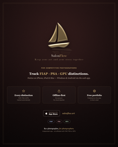
The flat, two-dimensional mark is the version for the app itself: the App Store icon, the home-screen icon and the launch screen, plus the web, documents and UI. The three-dimensionally rendered gold sailboat is meant for marketing materials, that is, posters, social media and wallpapers, wherever the mark should read as a physical, dimensional object.




Reserved for posters, social media, and wallpapers, anywhere the mark should read as a physical, dimensional object. It is never used as the app icon, in web UI, or in documents; the flat 2D version above always belongs there.
What we never do to the mark.
Warm, calm, photographic.
The palette is built from tones of old gold and the darkroom, with no cold techno-blue and no loud accents. The source of truth is Theme.swift for the iOS app and style.css for the web.
Used exclusively to distinguish FIAP, PSA and GPU data in charts, badges and cards. Never as the color of the logo or a call to action.
Serif for character, sans for clarity.
Cardo carries headlines and quotes, giving the brand the elegance of old-fashioned print. Inter carries all UI, tables and longer copy, staying legible at small sizes, on screen and in print alike. The "SalonFlow" logotype itself is a custom vector drawing, not live-set type — see the Mark & Logotype section.
"Salon" and "Flow" are always one word, drawn in the same letterforms (see the vector in the Mark & Logotype section). "Salon" takes the foreground color, ivory on dark and umber on light, and "Flow" is always gold in the shade #C2A36B. The colors are never swapped and never replaced with another.
SF Symbols, with one exception.
The iOS app uses exclusively system SF Symbols. No custom icon sets, no emoji as UI elements. The one exception is the brand's sailboat symbol.
- Limits and information: a neutral icon,
info.circle, and the.secondarycolor. Never red or orange, so it never reads as stress. - Destructive actions: system red,
.role(.destructive). - Dismiss / close: always
chevron.left, never the text "Close". - Shapes: rounded corners (10–14pt,
.continuous), never sharp edges.
Consistent across every touchpoint.
The same palette, typography and mark hold together the app icon, posters, social media and wallpapers. Any new material should read as unmistakably SalonFlow at first glance.
Matter-of-fact, calm, human.
SalonFlow grew out of its author's own need. The person who built the app is a photographer who spent years competing in photography salons and had to track his own progress toward FIAP, PSA and GPU distinctions by hand, in spreadsheets and notes, where a mistake happens easily and a missed step is just as easy to overlook. The app is built on the same principle used to judge a photograph itself: precision, and respect for the rules each association set for itself. That is why SalonFlow takes no shortcuts and makes no estimates. Every number in the app matches what a photographer would find by counting everything himself; the app simply saves him the time and the worry. It is offline-first, because a photographer's portfolio and competition history belong to him, not to a server. Cloud sync through SalonFlow Light is therefore always optional, never required. This foundation, precision, respect for data, and a competing photographer's own experience, stands behind every decision in this brand book.
- Czech is the source language, and English is always a full, deliberate translation, never a machine one.
- Czech pluralization (1 salon, 2 to 4 salony, 5 or more salonů) is always respected, even in marketing copy.
- Never alarm the reader. Even a limit notice is information, not a warning.
- Sign-off for materials: "From a photographer, for photographers."